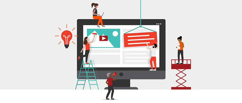
A well-designed landing page is a cornerstone of any successful digital marketing strategy. It is a focused platform to guide visitors toward specific actions, such as signing up for a newsletter, downloading an e-book, or purchasing a product. However, creating a conversion-optimized landing page requires more than compelling visuals and catchy headlines—it demands a blend of strategic design, persuasive content, and technical precision.
Here’s a step-by-step guide to crafting landing pages that convert.
- Understand Your Audience
Before diving into design and content, research your target audience thoroughly. Understand their pain points, preferences, and behaviors. Ask yourself:
- What problem are they trying to solve?
- What motivates them to take action?
- What might stop them from converting?
This insight will shape the messaging, design, and overall approach of your landing page.
- Define a Clear Goal
A landing page should have a singular, well-defined purpose. Whether it’s generating leads, boosting sales, or promoting an event, clarity is crucial. Avoid cluttering the page with multiple objectives that can confuse the visitor. A focused goal ensures the messaging and design stay aligned, increasing the likelihood of conversion.
- Craft a Compelling Headline
Your headline is the first thing visitors see, so make it count. A great headline should be:
- Attention-grabbing: Use strong, relevant words to capture interest immediately.
- Value-Oriented: Highlight the benefit of taking action.
- Concise: Aim for clarity and brevity.
Example:
“Boost Your Productivity with Our Free Time Management Toolkit.”
- Use Persuasive Copy
The body content of your landing page should build on the headline’s promise. Follow these best practices:
- Focus on Benefits: Emphasize what the user will gain, not just the features of your offer.
- Address Pain Points: Show empathy and position your solution as the answer to their problem.
- Be Clear and Concise: Avoid jargon and unnecessary fluff; clarity wins conversions.
- Incorporate Social Proof: Include testimonials, reviews, or statistics to build trust.
- Create a Strong Call-to-Action (CTA)
Your CTA is the pivotal element of the landing page. Ensure it’s:
- Visible: Use contrasting colors and prominent placement.
- Action-Oriented: Use verbs that prompt immediate action, such as “Download Now” or “Start Free Trial.”
- Specific: Clearly communicate what the user will get by clicking the button.
Example:
“Get Your Free E-book in Seconds!”
- Optimize for Mobile Users
With the increasing dominance of mobile traffic, ensure your landing page is fully responsive. A mobile-optimized design includes:
- Fast loading times.
- Clickable buttons and forms sized for touchscreens.
- Simplified navigation to avoid overwhelming users on smaller screens.
- Simplify the Form
If your landing page includes a form, keep it short and simple. Only ask for information that’s absolutely necessary. For example, instead of requesting a full name, phone number, and address, consider starting with just an email address.
- Leverage Visual Hierarchy
The design of your landing page should guide users toward the desired action. Use:
- Whitespace: Avoid clutter to draw attention to key elements.
- Bold Fonts: Highlight headings and CTAs to make them stand out.
- Strategic Imagery: Use relevant images or videos to reinforce your message.
- Incorporate Trust Signals
Building trust is crucial for conversions. Include elements like:
- Testimonials and Reviews: Positive feedback from previous customers.
- Trust Badges: Security certifications or guarantees like “Money-Back Guarantee.”
- Case Studies: Real-life success stories showcasing the effectiveness of your offering.
- Test and Optimize
Even the most thoughtfully designed landing page can benefit from testing and refinement. Conduct A/B tests to determine what works best for your audience. Test:
- Headlines.
- CTA placement and wording.
- Visual elements like colors and images.
- Form fields.
Analyze performance metrics such as click-through rates, bounce rates, and conversions to identify areas for improvement.
Conclusion
Creating a conversion-optimized landing page is both an art and a science. By understanding your audience, focusing on a clear goal, and using persuasive content and strategic design, you can create a page that not only attracts visitors but also drives them to take action. Regular testing and optimization will ensure your landing page stays effective in an ever-evolving digital landscape.
To learn more or to acquire our services, please contact us at https://paypercampaign.com


